Work in progress · Personal project
A Design System I Actually Like
JUJUBE: an opinionated design system, built for taste first. Work in progress.
Personal projectTL;DR
Most design systems look the same, so I started building one I actually like. JUJUBE is a work in progress with a Colours foundation and a Badge component so far. The Figma file will be available soon.
The Short Version
I find that most design systems are the same. Same neutral greys, same rounded blue buttons, same docs page. I wanted to try something different, something I like. So I started JUJUBE. It is a work in progress: two pages exist so far, a Colours foundation and the first component, Badges. The Figma file will be available soon.
The Mess
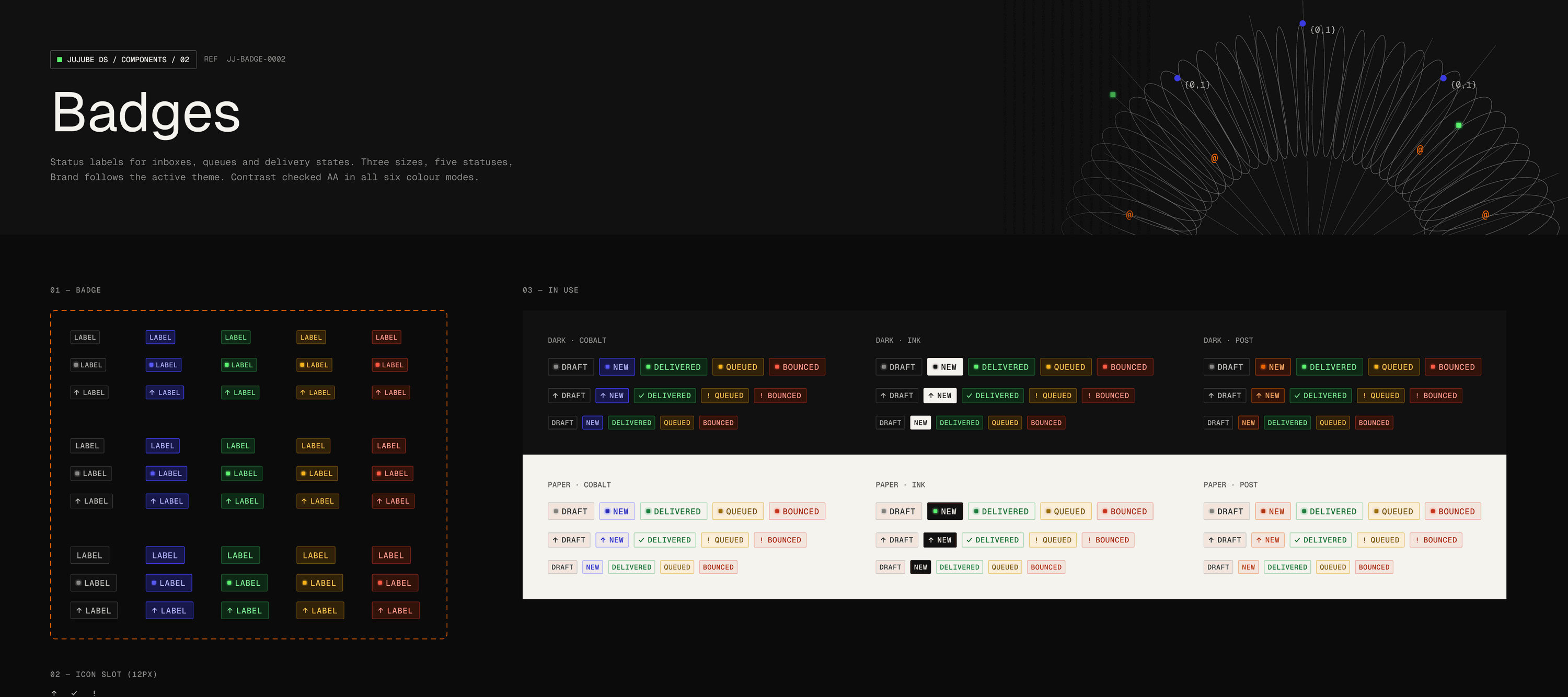
The risk with an opinionated system is that taste alone isn't enough. A palette that looks good still has to pass contrast, hold up across themes, and stay legible at small sizes. So every swatch is linked to its variable and labelled with its best WCAG contrast, and every component is checked in all six colour modes, Dark and Paper, each with Cobalt, Ink and Post.
My Part in This
- Defined the foundation: ink and stone neutrals, a cobalt brand accent, post orange, and signal greens for live states.
- Built a state palette for success, warning and error, each with background, border, text and dot tones for Paper and Dark.
- Documented every colour with its hex value, variable and AA or AAA contrast rating.
- Designed Badge as the first component: three sizes, five statuses, and optional dot or leading icon.
- Gave the documentation its own identity, with a reference code per page and a signal-torus header illustration.
Choices Were Made
- Skip the default blue-and-grey look and start from ink, warm stone and a single bold accent.
- Keep Brand tied to the active theme, so the same Badge reads correctly in Cobalt, Ink or Post.
- Show contrast on the swatch itself, so accessibility is part of choosing a colour and not a later audit.
- Show each component in every mode side by side, so a theme problem is visible immediately.
- Ship it in the open as a work in progress instead of waiting until it feels finished.